Choosing a Layout and Template for Your Online Store

Reinventing the adage, design is in the details. A powerful and practical design will always deliver, which is why it is important when laying out the primary door for your possible viewers and guests into your brand by coming up with an online store that works.
There’s tons of material you can read up and even use when you visit the blog, but we’ll also discuss some strategies and common techniques that work, which you can employ for setting up your online store.
1. The Clean Minimalist
You can never go wrong with a minimalist style in the current era. Though this might seem true to most, the science and the art behind an effective minimalist effect are still to be learned.
When people say less is more, you still have the important elements foregrounded in your site–this is targeted towards your Call to Action buttons and links. No ho-hum, focus on actual objects. This is the goal of a clean, minimalist design style.
The best part about sticking to this design is that maintaining your site and your content will also be minimal as you won’t have to redesign constantly. However, make sure that this style fits your brand’s words.
2. Going Mobile
Considering that people use their mobiles more than their laptops or desktops to access websites, you’ll want to design your mobile-friendly online store. This means that you’ll pay extra attention to font and navigation. You will want to use fonts that are readable on mobile and in a size that works well on the same platform.
Navigation should also be easily accessible on mobile so veer away from navigation bars that are too small. The best way to address this is to double-check how the site looks and feels on mobile before going live.
3. Employing Animation
Though making use of animations in your site might sound intimidating, they’re relatively easy to employ especially pre-made ones that you can customize. You can use video backgrounds or dynamic slideshows as headers in sections to create a moving contrast within the space.
Additionally, simple (and even small) animation works wonders in helping design work. You can even use them for what seems to be menial things, such as a loading or downloading screen.
4. The Modular Approach
Just because creativity requires you to think outside the box doesn’t mean boxes aren’t useful. Design is a marriage of art and science; sometimes, employing boxes can greatly organize the look and feel of your website.
This also works well on content pages, such as comparing products, showing different packages, and juxtaposing options.
5. Using Gradients and Illustrations
If your brand speaks a burst of color, then gradients will be your best friend. Not only do they create a splash of color through the transition effect, but they also create a pseudo-dynamic eye movement for your viewer.
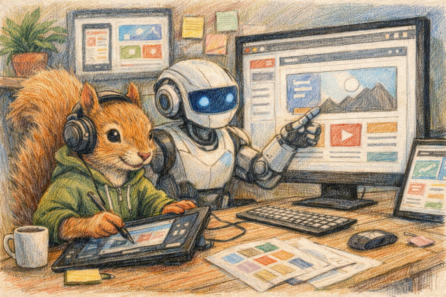
Of course, illustrations are essential in a website–no matter what product or service you may be selling. Illustrations that match what your brand is saying and the text content creates a fully human experience for your audience with your brand.
6. Understanding the Negative Space
If illustrations and visual elements are used to organize content, negative space is what can be employed to clean up the whole look and feel of your website. Empty (or white) spaces is what we call negative space, and they work well to give your eye some rest from the content and the images, thus making the page look cleaner.
It also cues your viewer to focus on specific parts of the site.
7. The Wonders of Typography
Font greatly impacts a reader, which is why knowing which font to use for specific elements in your website is crucial. Apart from this, you should be able to use at least two different fonts that work well visually and are complementary.
Choosing the suitable typeface will not just discuss what is pleasing to the eyes but will also entail proper usage of kerning, effects, and functionality across platforms.
8. The Efficient Navigation
Creating an online store will require the most basic Call to Action buttons. These include the home or landing page, a shop menu or catalog button, a page dedicated to discussing what the brand is about, a page on how to reach or contact you, and/or a gallery of your products or service if not incorporated into the shop menu.
Efficient navigation will ensure that people can get to the page they’re looking for and do so easily. This entails choosing a simple, intuitive, and fixed navigation bar that can be accessed across any of your pages.
Companies like Canva give you access to the most basic tools to set up your online store, even with a free account, and this is just one of the resources you can tap into as you start thinking about the design that will work best with your brand and what it has to say before fully going live and launching your online store.