Your Ultimate Guide to Creating an Effective Marketing Brochure

Did you know that 45% of all businesses will fail within the first five years? Businesses usually fail because they don’t make enough money or get enough traffic to sustain their operations. If you want to give your brand a better chance, consider marketing brochure options.
Many people think that brochure content is obsolete, but this isn’t true. Brochures are still a great way to attract attention and bring more traffic to your business. But you won’t get far if you don’t know much about brochure design.
You need to make sure that your brochures are as catchy as possible, but how can you accomplish this? Keep reading and learn more about what you should do to make your marketing brochures more effective.
Make Sure the Design Reflects Your Brand’s Message
If you want your brand to be a success, you need to show how unique it is. There are infinite possibilities for brochure design, but not all of them will fit your brand’s unique message. Suppose you have a business that sells gardening supplies and soil.
It would make sense to have your brochure’s design reflect this message. Any brand that involves gardening will usually use green and other natural colors to blend well with its message. They may also use many illustrations and pictures of vegetables, flowers, and other things you might find in the garden.
This ensures that before a person even starts reading the brochure, they will have an idea of what it’s about. This is a great way to give a person a good first impression of your brand. But your brochure would be very confusing if its design looked like it belonged to a different industry.
If your brand sells gardening supplies but the brochure is very gray and industrial, it wouldn’t send the right message. This is why you need to be careful when choosing your brochure’s design.
Understanding Your Brand’s Message
Before you design anything, think about what you want your brand’s message to be.
Does your brand focus on taking a natural approach to a common problem or aspect? Is your brand industrial or corporate? Does your brand sell a very niche product or service?
Once you narrow down what your brand is all about, it will be much easier to design a brochure that reflects it properly. You should design your brochure so that people will have an idea of what it’s about from afar.
You can accomplish this by using the right fonts, pictures, colors, and so on. But, you don’t have to go crazy with your brochures, either. You can still have a very effective marketing brochure with a simple design.
Sometimes it’s better to opt for a simpler design than a more complex one. This is because more streamlined designs are easier to look at and understand, especially at a glance. Once you’ve got a good design made up, you can print brochures here.
Use the Power of Color Psychology
While you might know that using the right brochure colors is important, you might not know why. Color psychology is something that almost every successful brand uses.
Color psychology refers to the emotional impact certain colors have on people.
You might wonder why emotions and moods are important for advertising. If you can make a person feel a certain way, they may be more likely to buy something from you. Consider a variety of fast food restaurants.
Many of them use the color red on their logos or somewhere in their stores. This is because red is associated with hunger and energy. Having this color represent their brand is a great way to make people subtly aware of their hunger.
This would compel them to eat at that restaurant. Red is also one of the most visually attractive colors to the human eye and it is very hard to ignore. Different shades can stimulate the brain in different ways.
Consider warm shades like orange or yellow. Both of these are associated with increased energy. Yellow is specifically associated with joy since it has a strong correlation with sunshine.
Because these colors are brighter and more energetic, they are often used by brands that have something exciting to sell. You may often see these colors used on brochures for amusement parks and other exciting attractions. Then consider cooler colors like blue, purple, and green.
The Unique Power of Colors in Marketing
Blue and purple have long been considered intellectual and calming shades. You will often see them used in advertisements for medicine, corporate businesses, universities, and so on. Green is an especially calming color because it’s associated with nature.
There are also neutral shades. These include black, brown, beige, white, and gray. These shades are often used for borders and fonts, but they can also dominate a brochure.
Because these shades are neutral, they don’t promote much of an emotional response. They are often used for corporate brochures, law firms, and other formal brands. The problem with using only neutral shades is that using too many of them can make the brochure look boring.
This is why many people prefer to blend these shades with more colorful options. This gives the brochure a pop of color while still having a more professional and sleek look. It’s also important not to use too many colors in a small space.
Many people think that more is always better, but this isn’t true of colors. Using too many can make your brochure look jumbled and confusing. A person might not know what to look at when trying to read it.
Using too many colors can also make your brochure an eyesore. It’s better to choose a limited color scheme. Most brochures don’t use more than three or four colors for the entire design.
This may not sound like enough, but you’d be surprised at what you can do with a limited scheme like this. One shade can be for the font while the other can make impressive designs and features. This ensures that the brochure has plenty of color but isn’t overwhelming.
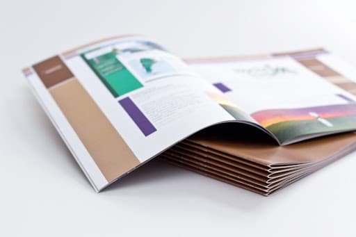
Choose the Right Images and Fonts
Once you have your color scheme sorted out, it will be time to move on to images and fonts. The images you use will continue to correlate with your brand’s message. Some people like to use photographs for their images, while others prefer to use illustrations or similar graphics.
There is no limit as to what you can do with images in a brochure. But as with colors, you have to be careful not to go overboard. Including a bunch of images may seem like a good idea in theory, but in practice, it will make your brochure an eyesore.
Too many images can also make it difficult for people to read the most important points of the brochure. They may be too distracted by all the graphics. Consider the size of your brochure and think about the balance between the text and images you want to use.
If you don’t plan on including that much text, you can be more liberal with the graphics. But if your brochure is going to be packed with information, there might not be enough space for many graphics.
It’s also important to not lump together too many blocks of text in one place. While this is a sure way to input as much information as possible, it can be hard to read. Someone might pick up your brochure, see some massive paragraphs, and get so overwhelmed that they decide not to read it.
Try to break up these blocks of text with a few attractive graphics. This will create a more natural and attractive balance between the text and graphics. You also have to consider how the font will play a role.
What to Avoid With Fonts
Many people don’t realize how important the right font can be. Many people make the mistake of choosing a more stylized font, such as cursive. While these fancy fonts can work for certain marketing brochures, they don’t work for most of them.
This is because these more stylized fonts are harder to read, especially when printed very small. If your brochure is hard to read because of the font, your readers might get so frustrated that they may put down the brochure before they get started. Some people are reluctant to use standard fonts because they think they’re boring.
But there is no need to go crazy with font design. You can leave the design for the rest of the brochure. Considering that the brochure’s text is one of the most important parts of the design, it should be easy to read no matter what.
You may want to avoid bright colors for your font as well. These can make the text hard to read. It’s best to use a dark font (preferably black) on light backgrounds.
If your background happens to be dark, you can use a light (preferably white) font shade. This will keep the font clean and concise.
Lay Out the Brochure’s Information Correctly
Once you have the main points figured out, you have to think about how to put them all together. The brochure layout will determine whether that brochure is a success or a failure. Some layouts can make a brochure look messy and confusing.
This is the last thing you want if you’re trying to advertise an important product or service. You need people to direct all of their attention to what you’re trying to market. Your design should stick with them, too.
You need to make sure that it stands out from the competition. The front of your brochure is the most important because it is the first part that anyone will see. It is much like the cover of a book.
If it looks boring, most people won’t bother to pick it up. But if it has a unique graphic or other feature that makes it stand out, it will be far easier to get people interested. The first challenge is getting someone interested enough to pick the brochure up, open it, and read it.
The cover accomplishes most of this.
Making Sure the Brochure Looks Good
The next step is then making sure that the marketing brochure’s interior is as attractive as the exterior. You also need to introduce the important info inside the brochure without making it too overwhelming.
This can be difficult since brochures only have so much space. This is why you need to master the balance between the brochure’s design and text. You also need to consider what points you want to make in the brochure.
Are you going into a lot of detail about a product or service? Do you want to reserve one side of the brochure for a lot of text and the rest for graphics? Or do you want to put small paragraphs throughout the brochure to make it easier to read?
You can experiment with a few different designs until you find one that looks good. You can also ask others to review the brochure to see if it looks good from another perspective.
How to Create the Perfect Marketing Brochure
A marketing brochure can do a world of good for your brand, but only if you design it right. This is why you need to consider the brochure’s colors, graphics, fonts, and layout. Mastering the brochure’s design will ensure that it will do a great job of being an effective marketing tool.
Do you want to learn more about marketing? Check out the other blogs on our site.