
Are you ready for 7 tips to capture more leads on your website? You’ve come to the right place! One of the most critical functions of your organization’s website is to generate leads.
You can have the best-written website in the world but, if visitors just read a blog and don't engage, that's not good. Customer engagement and converting visitors into leads is the most important function of your online strategy, and your website is just a part of your strategy. Luckily, there are several different ways to increase your leads and turn website visitors into future customers.
When reviewing your site it's important to understand that improving leads is an intricate process and there isn't one specific solution. Lead generation depends on site design, customer engagement, and testing what draws attention and when to ask for more information. There are several different aspects of your online presence that relate to effective lead generation. Here are 7 tips on how to generate more leads.
First things first, to generate leads you need a mobile-friendly website. This might seem basic but it’s critical. Mobile phones are now the most dominant method of accessing the Internet. Data from Pew suggest that smartphone ownership is a large section of the market. Part of lead generation is making sure your customers can access your site without getting frustrated. Sites that aren’t optimized for smartphones or tablets are annoying to use. If a visitor can’t navigate your site they’re not going to become a lead. They will leave. Ensure your site is mobile responsive and works well on all phones, including the latest like the iPhone Xs.
As technology improves streaming video is a larger part of the internet experience. Add to this smartphones with sharp screens and fast cellular data, and this trend will only go up. Videos are highly effective because pictures can easily explain what your company does to potential customers. With an article, you hope they read it and more importantly understand it. With a video, you can answer common questions and clarify anything that needs explaining. Videos are useful if your product isn't easily understood. An informed visitor is more likely to become a potential lead.
To get a new email subscriber, give them something of value. A free gift can take many forms and doesn’t have to be physical. A discount coupon on a future purchase or an educational ebook can be enticing to visitors especially if it solves their problems. Ebooks allow you to show off your industry knowledge which further builds consumer trust.
When generating leads, live interaction is a highly effective approach. With a live chat, you can ask questions of visitors, clarify information, and collect important profile and contact data. Live chats are easy to use, visitors don't have to make a time-consuming phone call and are more likely to use them.
A quick way to increase lead generation is to put your forms (email signups or information requests) on pages that generate a lot of traffic. Review your analytics and look for pages that get a lot of visitors like popular blog entries. As a result, by putting forms on popular pages you increase the odds people will see them and fill them out.
A key reason people don’t sign up for email lists or requests more information is they find a pop-up invasive or distracting. By having a box slowly slide in from the corner of the page as a reader scrolls is much less off-putting. It captures the reader's attention without the negative reaction pop-ups tend to generate.
A visitor who is carefully reading through your blog entries is likely already interested in what you're offering. A well-placed subscription box at the bottom of your blog lets people subscribe without causing a distraction or being invasive.
Together, this combination of implemented tips can help your site have the infrastructure needed to grow an audience and successfully capture leads. Therefore it's crucial to take time to evaluate against this list and set a plan to get moving on the components you are missing!
Need help? Contact me to discuss ways my team can help make this a reality for you!
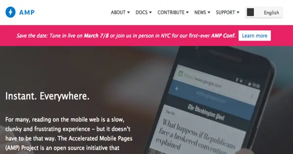
Google Accelerated Mobile Pages, also known as Google AMP, is a relatively new framework by Google that focuses on mobile content. When you follow this open-source standard, your website page content loads immediately on mobile platforms for the best quality mobile user experience. With more web users using mobile devices to surf than desktop, it’s an important item to consider. So how does this work, why does it matter and is it worth the time to implement on your websites?
An AMP web page is a static, simplified version of your web page that doesn't have resource-intensive elements on it. When a mobile user clicks on an AMP result, the article loads right away rather than going through a lengthy loading process. While you host the page yourself, you can also take advantage of Google's AMP Cache and third-party providers to cache and distribute the page for better load times.
Google's search engine ranking algorithm has made many mobile-centric changes over the past two years, so staying on its good side by catering to your mobile visitors is a good idea for ranking well. Google is also highlighting AMP pages in some results, which gives your content greater visibility with this audience. They're also marked in the search results, which can help you stand out from competitors that aren't using AMP.
You also provide a better user experience overall for mobile visitors to your site. The majority of your market has smartphones in their pockets, and they're doing a lot of reading on their devices. Your primary website may have a responsive design that adapts to the size of the screen, but the smartphone still has to render all of the visual elements on the page, supported scripts and other resource and data-intensive features. With AMP, all they need to do is load up the particular page without anything that's going to kill your page speed or their data limits.
You do need to take some time to implement AMP on your site, but your content management system or a good web developer may make this an easy and hands-free task for you. For example, WordPress has an AMP plugin that serves up this content without a lot of hands-on work. Other sites simply need a developer to implement the AMP protocols once and it will be done and ready.
Whether now is the time to implement it will be up to you. You can join in early and get a headstart on the competition or you can wait and follow suit in due time.

Mobile has officially overtaken desktop as the primary means of using the Internet.
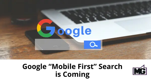
Questioning this yet? Look no further than Google's latest change in their algorithm. The internet search giant recently announced that they would release a mobile search index separate from their existing desktop index. This is the way Google scans sites and ultimately determines where sites come up in search rankings. This change alone is already a major change, but the clincher is the fact that this new mobile index will be the primary method of determining search ranking.
Considering how fast people are adopting smartphones and tablets, it's a wise move that flows with the logical progression of the web. Desktop searches, once Google's lifeline, have been overtaken and account for less than 45% of all searches done on the web for some time now. As it turns out, more often people do use mobile devices to look stuff up.
But now that this decision by Google to index sites via mobile first is here waiting to be rolled out, there are more questions than answers.
The answers to these questions will be much clearer in the coming months, but it's safe to say that the following insights can help your business plan ahead now:
You'd think most sites already have this, but a surprising number still don't. If you're one of those businesses who've been putting off a mobile version, you now don't have much choice left but to adapt.
Otherwise, your site will rank poorly on search engine result pages, and that's something you don't want to happen. Google takes into account in search rankings whether your site is mobile friendly or not.
Due to the compact sizes of handheld devices, many mobile sites carry far less content than their desktop counterparts. This can make it for easier viewing on smaller screens. But with Google's new algorithm, mobile sites will also have to be optimized, more so than desktop sites, and need to carry the full website content.
No longer can there be a simpler mobile version with less content. If this is the case, that site will hurt in searches. The key would be to have a responsive website, one that “responds” to the device (mobile, tablet, desktop) that the user is on, and that at any device size it has the full website content.
Mobile used to be an alternative, an option. But things have changed. It's now the default, relegating desktop queries to minority status.This means you need a mobile strategy more than ever. If you're still attached to the desktop, you have to change your mindset and make mobile your primary concern.
Font size, page load speed, scroll depth, and responsiveness are just some of the design elements you must consider for your mobile site. As well, lead capture is important to consider. You need to have a great mobile user experience that helps you capture leads. That’s a great strategy piece to have in place.
The world is going mobile, and so should your site. Google is already at the helm, so act now if you don't want to be left behind.