4 Web Design Best Practices to Improve Conversion Rates

If there’s one thing online business owners put on top of their priority list, it’s conversion.
To them, it’s common knowledge that having good products or services isn’t enough to convert visitors into customers.
One big factor for conversion rates is the design of landing pages and websites. Customers, nowadays, have short attention spans that, if not taken into account, could be fatal for business.
Customers want ease of use when it comes to online browsing and shopping.
In this sense, web design plays an important role in making sure that your customers are interested and satisfied whenever they visit your website.
This guide we will look into the best web design practices to increase your conversion rates.
Let’s dive right in.
1. Content Placement
What people initially see on your webpage is a big factor when it comes to conversions.
A properly-designed website is often uncomplicated, making it easy for the web visitors to see the parts that the website owners wants to draw their attention to. This could be the call-to-action buttons, banners, texts, etc.
This is where proper content placement comes into play.
Effectively placing positive spaces according to design principles helps your visitors decide on what their next step will be. They might browse further or leave the website altogether.
When you think about content placements, there are three crucial principles that you need to consider — the “F” pattern, the “Z” pattern, and the rule of thirds.
“F” Pattern
For websites with a lot of reading content, using the “F” pattern would definitely lead to more conversions — given that the content is also enticing.
To define, the “F” pattern pertains to the movement of the eyes when reading content online.
The eyes start scanning from the top-left side of the page moving towards the top-right – usually for headlines or titles.
It eventually moves down as your web visitor reads further. Their eyes move right if there are headlines or bolded sentences that catch their attention.
Using this site’s blog as an example.
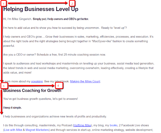
The blog follows an F-reading pattern which makes it easier for visitors to scan through and read the content at ease.
“Z” Pattern
To state the obvious, the viewers follow a “Z” pattern when scanning through a web page.
This is commonly used by websites that don’t utilize much reading content, pretty much like ecommerce websites.
Visitors start scanning the page from the top-left of the screen which usually contains the company logo and moves sideways towards the right side of the screen.
After reading those, the eyes travel downward diagonally from the top-right down to the bottom-left side of the page.
Let’s take Upwork’s homepage as an example.
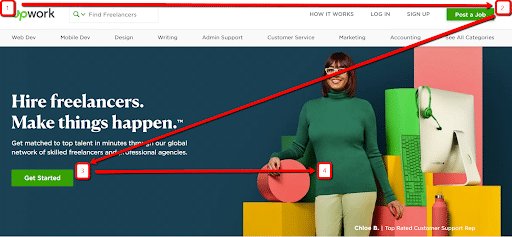
As you can see, the pattern the viewers make when scanning the site forms a letter “Z.”
The Rule of Thirds
This is a phrase you commonly hear in the field of photography.
However, this principle is also useful for websites.
Just like the grids found on cameras, using grids as you design the webpage can also be beneficial.
Let’s take SquareSpace’s website for example.
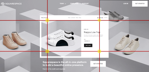
Using this principle guides the eyes of the visitors towards the center of the screen.
When you place the content where the lines intersect, the content is highlighted. In the case of SquareSpace, for example, the shoes they’re selling is highlighted.
If the visitor’s main objective was to buy something from the website, this principle would be useful for selling new products.
2. Negative Space
Negative spaces are essential in web design, as well.
Simple is better, after all.
Negative spaces keep your website organized and easy to browse.
Throw out the belief that every corner of the page needs to be filled by either an image or text.
Good use of negative space highlights the important things you want the customer to focus on – whether it’s your call-to-action or new products you want to sell.
Looking at Flat’s website, it uses a lot of negative space to direct visitors to its call-to-action.
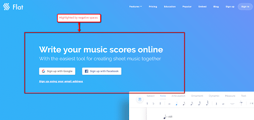
There aren’t many elements to distract the visitor which will most likely lead them to focus on the site’s call-to-action, which, in turn, can lead to conversion.”
3. History Tracker
Once engrossed in your website, visitors usually click one link after the other which takes them further away from their initial location.
History trackers are useful for the ecommerce industry, especially for websites with numerous subcategories.
For most users, they want to be able to go back to their initial location, or, at least, retrace their steps within the website.
It’s troublesome for customers to remember what category they’re already in. Chances are, they won’t even notice it.
Let’s take a look at Drunk Elephant’s history tracker.
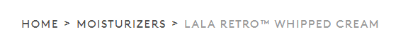 If their web visitors happen to click on a new item that’s on a different category, finding the previous item might mean doing a manual search on the site which takes up so much effort.
The worst-case scenario would be customers starting from scratch which affects their overall customer experience.
This flaw negatively affects conversion.
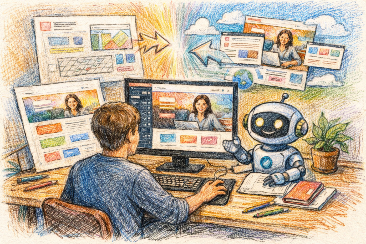
4. Human Faces
An effective way to increase conversion rates is to use empathy.
Utilizing human faces on web pages elicits emotions that help customers connect with your website.
By using faces that show the emotion you want your customers to feel, you’ll be in a better place to influence them to take action on your offers.
Look for photos that best showcase what your message, vision, and branding is about.
For most websites, it’s always a good idea to take photos of satisfied customers because it will give a realistic sense to what you want to showcase.
Look at how Nike uses a human face on their ad.
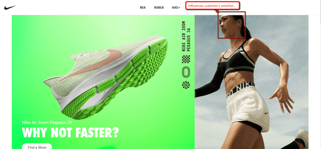
Showing the face of the model makes Nike’s ad more relatable to the people viewing it. Of course, the more relatable your ad is to your audience, the better your chances are of turning them into buying customers.
Conclusion
Good web design consequently leads to higher conversion rates, whether you are doing it by yourself or hiring an agency to design your website.
With such short attention spans, customers want to shop in websites that appeal to them and retain their attention for the entire duration of their online shopping.
The key to converting your visitors is to be direct and clear on the message you want to relay.
Don’t put in too many distractions and incorporate subtle guides on your website.
At the end of the day, your website design shouldn’t just be for show — it should help you get better conversions.